Because of my recent interest in logos lately, what if the world was in 2.0? What if? Of course, someone already beat me to the idea.
 If everyone in the world was two point oh. Shiny reflections. Pastel colors. Teletubby speak. Cute little people. Rounded corners. Pink.
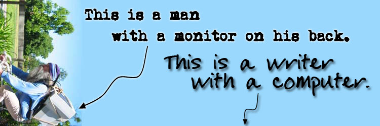
Anything can be a noun with the addition of a r. Or the deletion of an e.
But the only true logo in all of this is the at&t logo. Instead of the former flat world and the AT&T in uppercase, we have fallen to a flatter, ambiguous logo. What happened?!
For potential web 2.0 designers and a reminder to self:
Need a color palette? Here’s one (Along with a flickr pink!)
Need a web 2.0 in 10 seconds? Help is here!
Need something to tell investors? Someone knows what to say
Forget what web 2.0 really means? Doooh
One designer said that the “web 2.0 is the new black”.